
Nerd Nirvana, Art, and Simplicity

Benefits > Features
It was late one evening in the agricultural engineering department computer lab at University of Florida. There about twenty computers in the room. And a printer or two. It was around 1996 or 1997. They were PCs with the Mosaic browser. And office productivity software made by Lotus. Microsoft Office was not the de facto software it is today.
That evening I had to create a presentation for class. For the first time I opened Lotus Freelance Graphics. Never heard of it? It was an early presentation software like Microsoft PowerPoint. And it was glorious.
So many design options. Colors. I literally sat there for hours goofing off. Exploring what you could do with this software. It made an engineer an artist. Eventually Microsoft Office smite Lotus Freelance Graphics along with Lotus 1-2-3, Corel WordPro, and Quattro Pro from the surface of the Earth.
Today, PowerPoint (and Apple Keynote) help people create amazing graphics. And there are many other visual design software tools.
Charts. Flow charts. Graphs. Tables. Infographics. These can all be great communication tools. Or they can damn your messaging to hell.
True statement. You can fail in your efforts to achieve your desired outcome when you don’t understand your audience. You can truly create and deliver more than any person needs to see with their eyes using any of this software. Presentation software can be an enabler which helps you miss the mark on how to communicate with those people. When this happens, your audience is likely to become unsure and unclear of what they should do next.
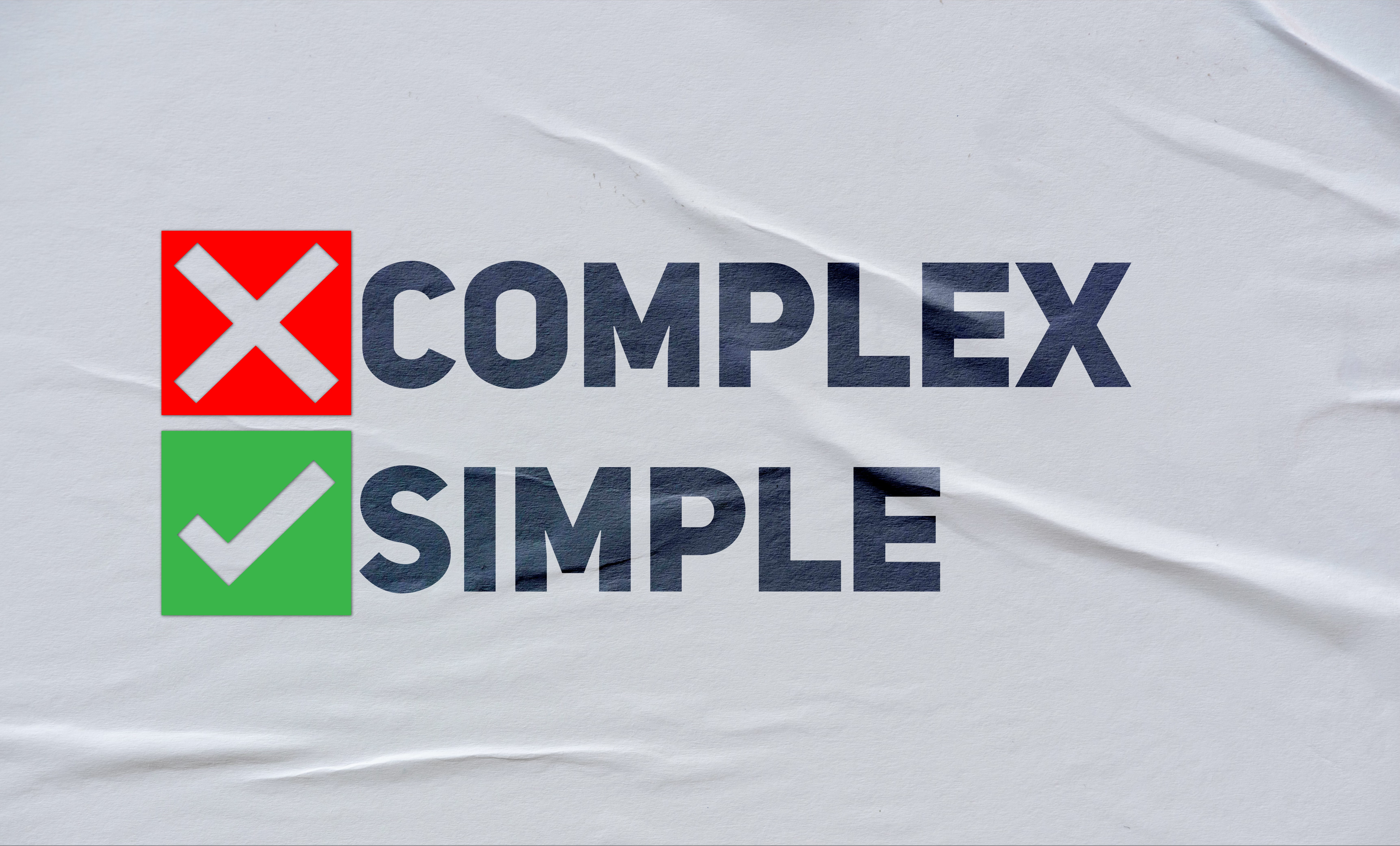
I mention charts and related visual tools because they can (and should) simplify the data in the image. When the communicator gets carried away with the design, things can go badly quickly.
It can be tempting to get really creative when designing a chart, a graph, or some other visual. I know. I’m an engineer. It truly floats my boat to create charts and images that an audience “should” appreciate and understand. Something that is more complicated than necessary. It’s geek art.
To see a book of charts, graphs, etc. is a thrill. I saw this book at Barnes & Noble and bought it. I have never read it. But, man, when I flip through those pages it’s nerd nirvana.
And most people do not give a damn how beaut of an overly complex chart . Their eyes glaze over. Some brain cells die. From then on you are associated with bad visual design and migraines.
Any visual communication has to have a clear purpose. When you create one of these images, it should at a minimum follow these guide lines:
Avoid overwhelming viewers
No busy or complicated design
Use simple colors that contrast well with one another
Be obvious why a person would care about it, i.e. how it helps them achieve a result
If it can’t help a person, they don’t need to see it
Help people understand complex data more quickly and clearly
Provide context (labels, etc.) for the image
Provide minimum level of complexity needed for audience comprehension
Members of you audience need to understand and be able to explain its meaning and purpose to other people
Include source data, creator identification and contact information
Beware of options and templates in Powerpoint and Keynote. Yes, they look cool. Just because you can create something doesn’t mean you should do that.
In summary, a person viewing your visual design it should be able to understand it, apply its information, and talk about it without having to be told what it means by its creator.
Always go back to this question. Are you explaining how something benefits/helps people or how something works? Most people don’t care how something works. There is a place for more complex visuals. Such as with engineers, scientists, and people like this. If your audience makes something. Or have to make it work with something else. Even when this is the case, understanding benefits helps design features.
Other than that, people just want to know how it will help them work and live. Benefits over features.